
The Challenge
What began as a cancer advocacy group, morphed into a software development company that is leveraging technology to transform the cancer care system. The goal is to use Artificial Intelligence(AI) and Machine Learning to create a provider interface for triaging voicemails in cancer clinics in our to provide a more efficient communication strategy with patients.
The task was to use agile methodology to explore an innovative experience to enhance the healthcare sector.
The Solution
Provide an intuitive user interface that allows for incoming communications to be transcribed and presented according to their importance/severity level.
Measuring Success:
SUCCESS METRICS
Problem level KPI: % of cases with a delayed response.
-35% reduction in the overall time required to assist patients, with an emphasis on high priority cases.
-Long term: An interactive environment that encourages a 20% of patient cases solved on a day-to-day basis. Thus increasing patient satisfaction ratings.
OUR APPROACH
Discover-Research, Analysis, Problems
Define-Affinity Mapping, Journey Mapping, User Flow
Ideate-Design Studio, Wireframes, Consultation with Stakeholder
Evaluate-Usability Testing-Hi-Fi

RESEARCH
Understanding the Business
The business focused and invested in AI machine learning as a solution
A major business goal was to have AI triage incoming communications on a tiered system from 0 to 4
Another goal was to have the software automate responses to inquiries triaged on the lower end in order to eliminate time spent by staff doing these easy yet time consuming tasks
Competitor Analysis
To get the best picture of our competitor I conducted a C&C analysis to determine what ways we could produce positive results. This would give our team the ability to learn from our competitors mistakes, while also finding ways to capitalize from their own successes.
Understanding the User
User Interviews
User interviews were a key piece of the research. It was very important to gain understanding around what would be most beneficial for our software. Most importantly I needed to gain an understanding of the pain points within the existing process. I scripted questions that would give the team insight into the daily activities of the clinic staff.
User Quotes
“The part that is frustrating for me is that if I don’t immediately document the phone interaction, I will forget to document it later since I have so many other things to worry about.
”
“If I could change at least one thing to make things easier, I would love to have my patient note up so it doesn’t disappear while I look up their chart information.
”
“You can’t catch it all when I’m taking 30 voicemails a day when I’m also seeing patients it becomes impossible to keep it all together.
”


Analysis Phase
Once we transcribed the interview notes, we pulled the important information and transferred them to sticky notes. We used the Affinity Mapping process of synthesizing the data we gathered from 6 interviewees. This process gave a clear understanding of their current process and the frustrations they all share.
From the research, I found that 100% of the users deal with rural patients that would rather communicate by phone rather than any other communicative method.
83% of those interviewed said the manual transcription of voice mails would be their biggest pain point.

Persona
Healthcare professionals like Paige are bogged down with manually handling the documentation of incoming communications. The system they use is inefficient and outdated. This situation leaves Paige with less time to perform her essential duties regarding patient care.
User Journey Map
Design
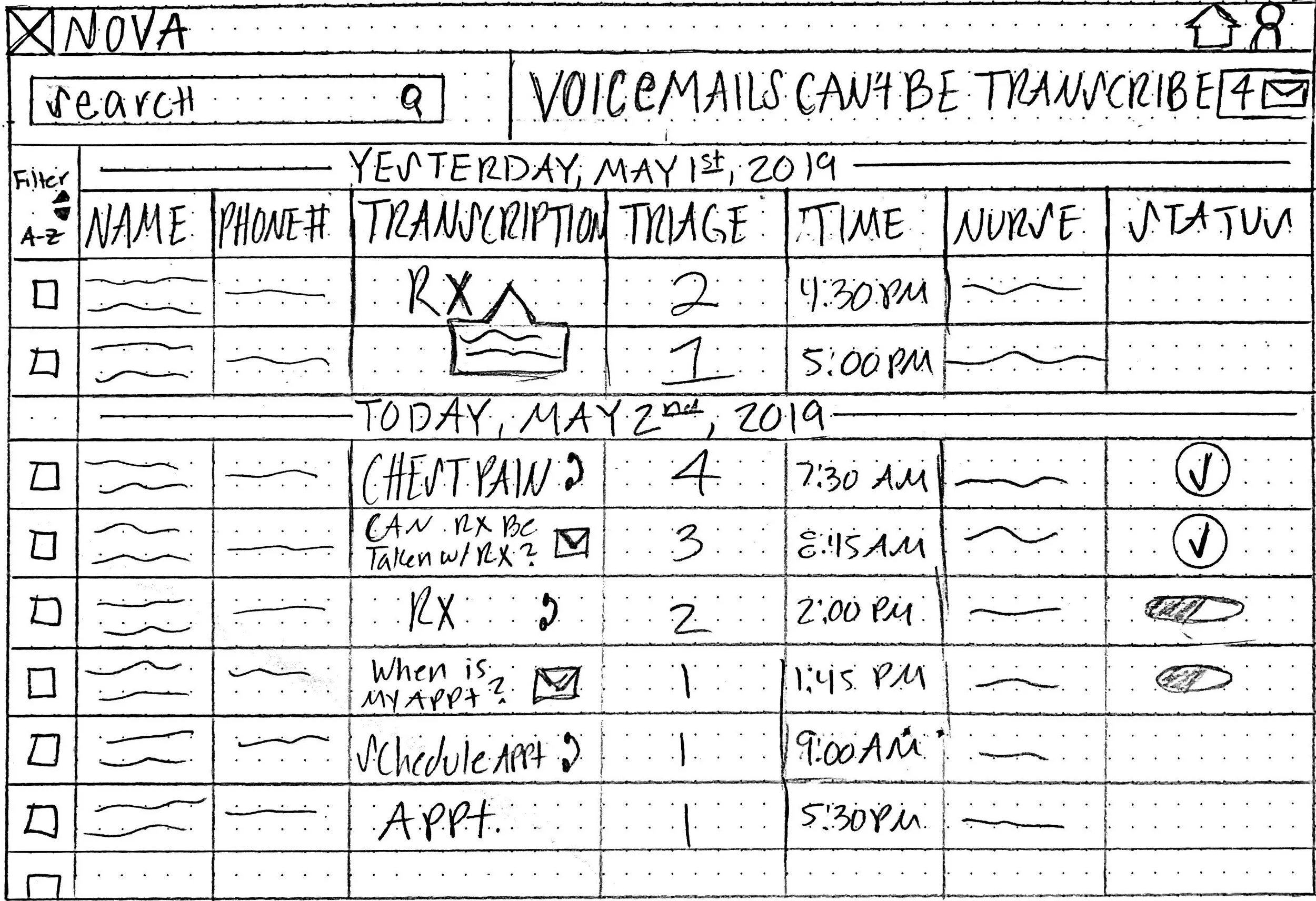
I decided that a great way to have multiple perspectives would be engaging in a design studio. A design studio is a type of UX workshop that combines Divergent and Convergent thinking, it allows UX professionals to explore a wide set of ideas and create a shared vision to move forward in a short amount of time. In this process each team member drew preliminary sketches that focused on the needs of the user. We used a set of requirements we discovered during the affinity mapping that include: screen for all voice transactions that would go through the NOVA system, a way to show if it was in-progress or completed, patient information and an additional method of showing Scheduling information.
The primary insights gained from this session were:
On the Main Task Screen
Applying the messages from previous day on top to be completed 1st
Short description of the call category
Select button that assigns the oncologist to the task
Filter
Incoming voice mails that could not be transcribed along with an audio message of patient inquiries.
Pop up idea with the message history with link to chart is the Plan A
On the Patient Screen
Place the contact info in the forefront
Transcription of VM and option to play the VM
Appt. Information - have option to click and reschedule and to send automated VM response for simple inquiries
Showing the history of the messages that have been handled.

Paper Prototype
Once determined what would be important, I went through and marked the most needed and intuitive pieces of each design.
The team made a composite list of the most important features and then created a new design based on the over-all needs of the customer and desires of the business.
We tested these screens for ease of use and understanding. Several things were noted in the testing.
Users found pie chart on the dashboard confusing
• Users had difficulty identifying the most urgent communication (number order)
• Users wanted long messages simplified into key words
• Business requirement change: Will not focus on integration with existing EMR (patient records)


Digital Wireframes
The next step involved taking the screens to non-direct users to check the intuitiveness of the flow and design. During those conversations, we were asked if there would be an indicator such as an icon to let the user know which calls were the top priority.
We chose to focus on 5 screens. The Login, the Dashboard, the task management screen, the personal task screen and the patient information screen

Usability Testing
The tasks to complete:
Find most severe case for Paige from yesterday
Send Appointment Reminder
Go to your Nurse Profile
Check your untranscribed voicemails

After the testing the following changes were made:
Birthday Differentiator
Pharmacy Info to Patient screen
Doctor schedule (and Dr. contact info) to Nurse Profile
“Forward to Dr. Button” to Patient Profile
Other Considerations
What else might you expect on each screen?
Was there anything you found frustrating about the process?
Was there anything you might add?
How intuitive was the process overall
Conclusion
I was able to create an interactive experience which the company will further refine as they engage in future sprints and release the final product. This data and experience serve as the ground work for additional testing and development as the dev team further understands the capabilities of the NOVA platform.
Next Steps
Phase 1
Additional User Testing
ADA Standard Revision
Use those insights to create high fidelity prototype
Provide MVP to development
Phase 2
Ability to integrate with Electronic Medical Records
Open the concept to practices outside of the cancer industry
Further explore the ability for automated response for NOVA