


0
items
$0
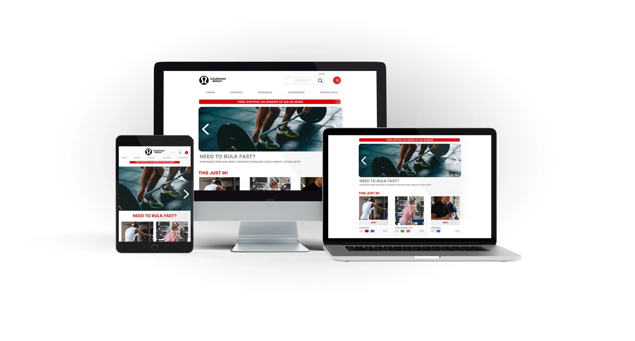
Surprisingly enough, Lululemon one of the top athleisure retailers in the industry does not sell the equipment meant to go along with the gear!
After a thorough evaluation I saw that this would be a great opportunity to improve their online website experience. The task being, to create a microsite that would address the needs and expand the revenue to a broader audience.
NEEDS
•Quick access to a range of options
•To know what’s new on repeat visits
•Reassurance by familiar brand names
•Social Proof from others to know what’s cool
•A feeling or relationship with the brand
PAIN POINTS
•Lack of sufficient product information
•Difficult navigation
•Expensive or unclear shipping charges
•Complex returns process
•Lack of trust with unfamiliar retailers
OPPORTUNITIES
•Establish trust and relationship
•Focus on new additions to inventory
•Make shipping and returns options easy
•Product ratings and related products to show
other customer behavior
OPEN CARD SORTING
CARD SORTING INSIGHTS
Many of my participants stated that the open card sorting task was difficult, they had too many overlapping fields. To iterate, I made changes to the way that I labeled the Closed sorting. Initially I had the title Gym Equipment, I then changed it to Exercise Accessories. Subtle changes like this were integral to guiding people to the correct category. I noticed that people followed visual cues, so whereas they imagined ‘Equipment‘ to be the large items, ‘Accessories‘ mad them visualize the smaller complementary assets.
I needed to focus on the core audience to see how they would properly categorize the items. It is tough for someone who is not consistently active to recognize the products. Though I wanted a broad range of users, I was not drawing from the insights of those that would likely use the products.
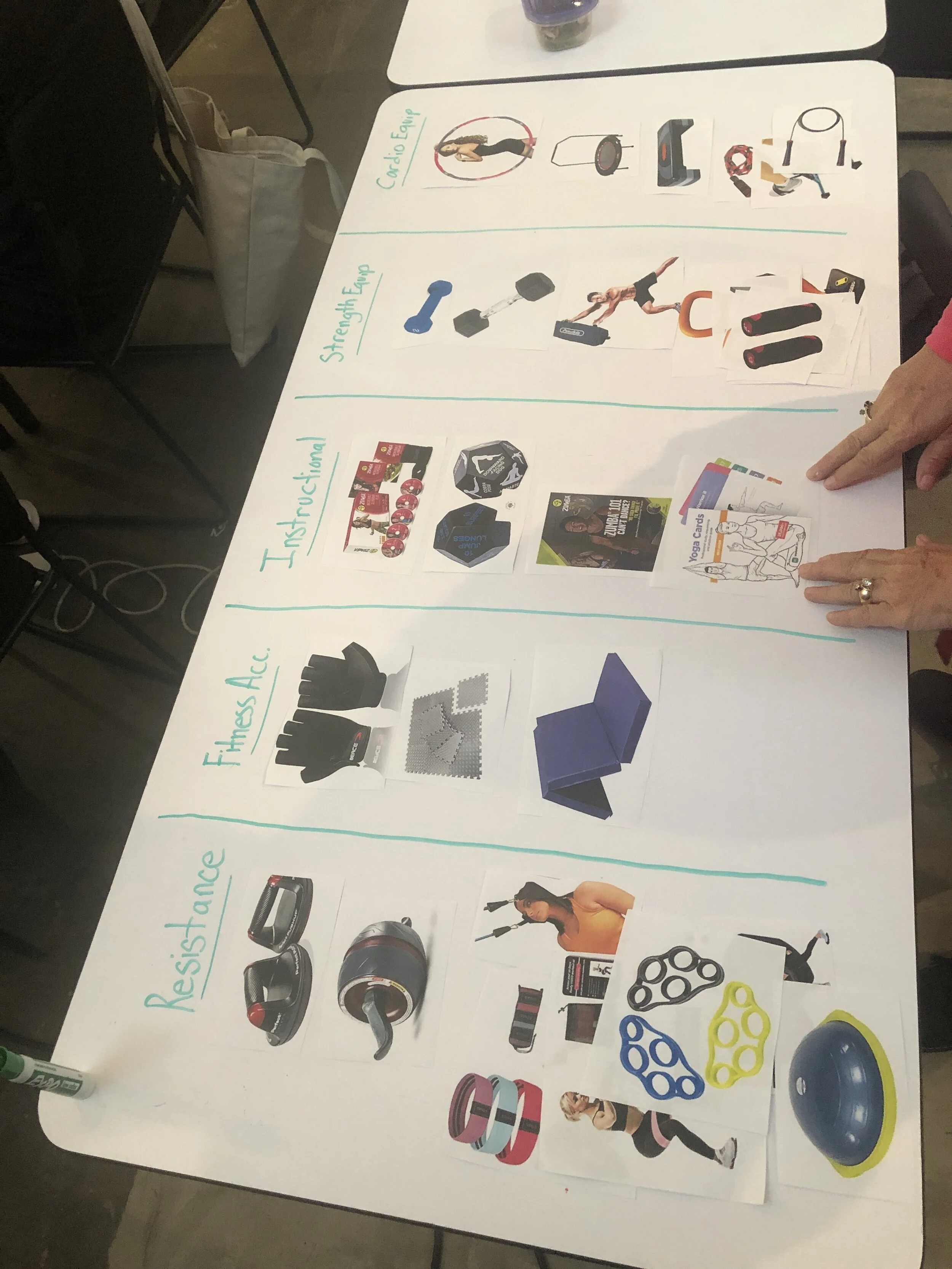
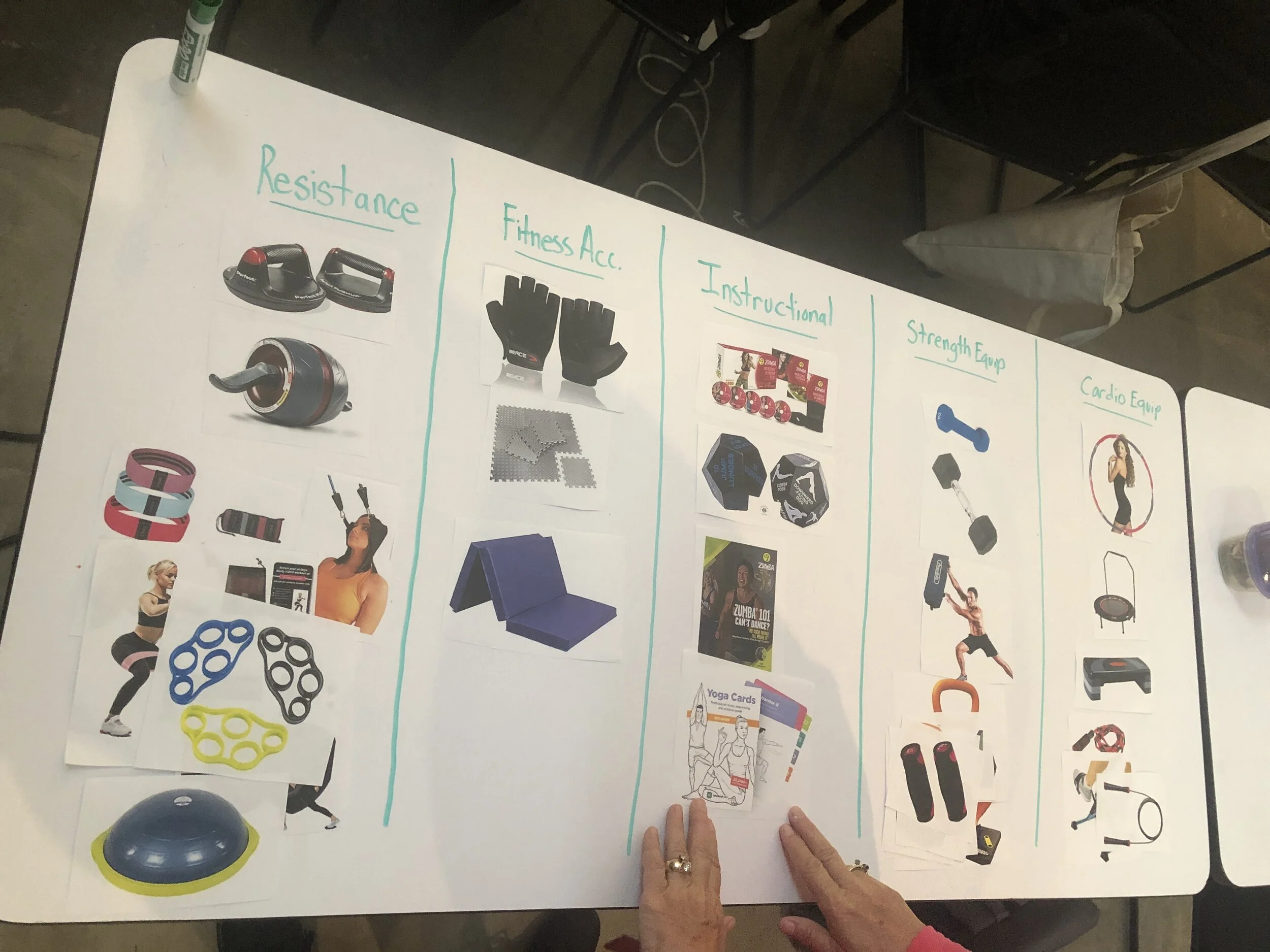
OPEN CARD SORTING
Results still were not unanimously consistent, however they were better executed in comparison to open card sorting. I found that people had less trouble attempting to group the products when they had the direction of categories. It was also great for me to narrow the scope of the participants to those that exercised. This is done in an effort make the prototype navigation more intuitive.
Taking directly from the feedback gathered from card sorting I was able to create a site map that was easy to decipher. My primary goal being to alleviate confusion as people were navigating the site. The taxonomy of the site is very important, without including Information Architecture, the site is sure to falter. Information Architecture is as vital to the site as the foundation of a house. As I engaged in the creation of the site map, I made sure to keep the users in mind taking from the insights, rather than deviating into my own personal opinions.
SITE MAP
USER FLOW
COMPETITIVE ANALYSIS
“In the long run, competition makes us better... it drives innovation.” -Dennis Muilenburg
Knowing the competition was the key to establishing what would potentially work, and what would mistakes to learn from. Competitive analysis was used to evaluate the site features of other sites that incorporate athletic equipment. I wanted to see how similar sites display their features, provide feedback on current products, along with the ease of use for finding new merchandise. I sorted the sites using the following metrics:
Product Description
Navigation
New Products
Shipping Charges
Product Ratings
Click To Enlarge Competitive Analysis
Developing the initial sketch, is where everything that I had gathered about the business and how my persona wanted to interact with it came into play.
Some of the primary differences that I introduced were the addition of a Live Chat, Twitter Testimonials, and New Items Indicator.
USABILITY TESTING
I conducted usability testing by having 5 users test the interactive prototype. Functionality was a primary goal along with Navigation.
These were Elliot’s primary concerns, thus making them important issues to tackle. After conducting usability testing and seeing the ease of use in the prototype, I felt confident that with further iteration the site would function in a way that the user could get from Home to Checkout without obstacle.
In order to have a functional Usability Test that would provide me with fruitful insights I created the usability Test plan as shown. After creating the document I now had the ability to create a gameplan of how I could approach the testing.
Conducting Usability Testing with users
One of the most rewarding pieces of the feedback was soaking in the way that different things are experienced from user to user! While testing with some I would have no error, however others were able to find many things that they felt would make their experience better. It reinforced that I love hearing the critique, and having the ability to create a product that the user will feel fully comfortable interacting with.
After receiving the feedback from users I was able to then create iterated versions of my prototype to then run subsequent tests.
To further improve on the app experience, the next step would be to create a hi fidelity mock up of the screens.